
How to Make a Logo Look Expensive
The difference between a logo that looks like it cost $50 and one that looks like it cost $5,000 usually comes down to a handful of deliberate design and print decisions. Clean typography, a restrained color palette, proper file preparation, and the right print finish can transform even a simple mark into something that feels polished and premium.
This matters whether you are launching a small business, refreshing your brand for new signage, or printing materials that need to impress clients walking through your door. A logo that looks expensive builds trust before you ever say a word.
This guide covers the core design principles, typography and color strategies, file preparation essentials, print finishes, common mistakes to avoid, and how to test your logo across every format. If you are in Dallas and need professional printing or signage, you will also find practical guidance on working with a local print partner to bring your logo to life.
Why an Expensive-Looking Logo Matters for Your Brand
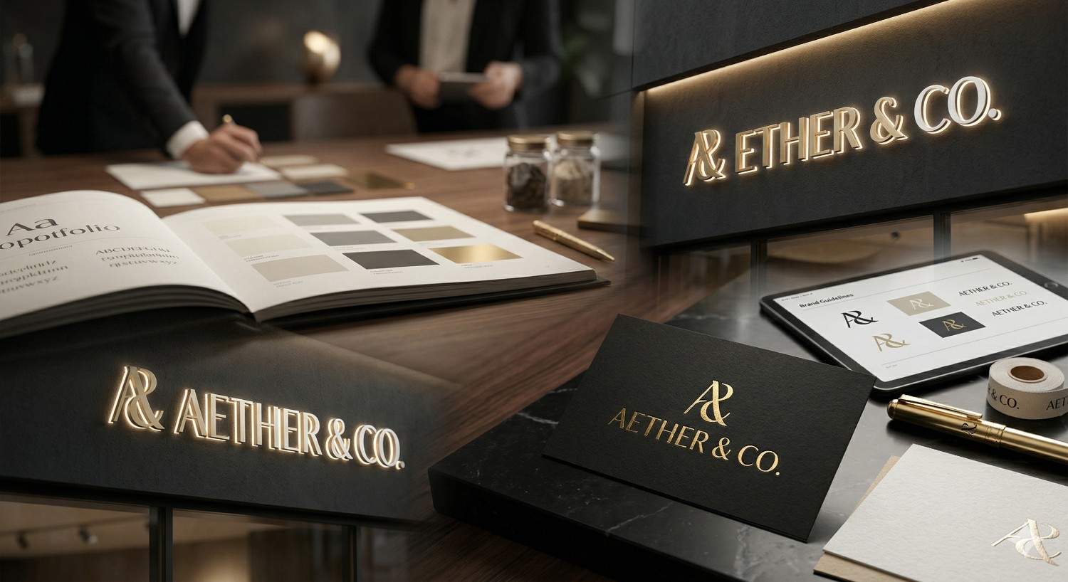
Your logo is the single most repeated visual element in your entire business. It appears on every sign, every business card, every invoice, every social media profile, and every piece of packaging. When that logo looks polished and intentional, it quietly signals that your business operates at a high level. When it looks rushed or generic, it raises doubt before a customer even engages with your product or service.
This is not about vanity. It is about perceived value and the practical impact that perception has on your bottom line.
First Impressions and Perceived Value
People form judgments about a brand within seconds of seeing its visual identity. A well-crafted logo suggests professionalism, attention to detail, and stability. These are the same qualities customers look for when deciding whether to trust a business with their money.
Think about the logos you associate with premium brands. They tend to be simple, confident, and refined. That perception of quality extends to everything the logo touches. A clean, expensive-looking logo on a storefront sign or a poster in a window display tells passersby that the business inside takes itself seriously.
For small businesses and professionals in Dallas competing for local attention, this first impression can be the difference between a customer walking in or walking past.
How Logo Quality Affects Customer Trust
Trust is built through consistency and professionalism. A logo that looks different every time it is printed, or one that appears blurry on a banner because the file was not prepared correctly, erodes confidence. Customers may not consciously think "that logo has poor resolution," but they register that something feels off.
On the other hand, a logo that reproduces crisply on a business card, scales beautifully on a large-format sign, and looks sharp on a poster communicates reliability. It tells the customer that you care about the details, and if you care about the details of your own brand, you probably care about the details of your work.
Core Design Principles Behind Expensive-Looking Logos
Expensive-looking logos share a set of design fundamentals. These are not trends. They are principles rooted in visual communication that have held true across decades of graphic design. Understanding them gives you a framework for evaluating your own logo and making targeted improvements.
Simplicity and Clean Composition
The most recognizable and premium-feeling logos in the world tend to be the simplest. Think of a single wordmark, a minimal icon, or a clean monogram. Simplicity is not about being boring. It is about removing everything that does not serve a purpose.
A cluttered logo with multiple graphic elements, decorative borders, and competing visual ideas looks busy and uncertain. A simple logo looks confident. It says, "We know exactly who we are."
If your current logo has more than two or three distinct visual elements, consider whether each one is earning its place. Often, the most powerful upgrade you can make is subtraction.
Strategic Use of White Space
White space, also called negative space, is the empty area around and within your logo. It is one of the most underused tools in logo design, and it is one of the strongest signals of a premium aesthetic.
Luxury brands give their logos room to breathe. The logo is not crammed into a corner or surrounded by text and graphics competing for attention. When you print a logo on a sign, a poster, or a business card, the space around it matters as much as the mark itself.
When preparing files for print, build in generous margins. If you are designing a sign or banner, resist the urge to fill every inch. Let the logo stand on its own.
Visual Balance and Proportion
A logo that looks expensive feels balanced. The weight of the elements is distributed intentionally. Letters are evenly spaced. Icons are proportional to the text. Nothing feels like it is about to tip over.
This balance often comes from working on a grid system during the design process. Even if you did not design your logo on a grid, you can evaluate its balance by looking at it from a distance or at a small size. If any element feels heavier or lighter than the rest, it may need adjustment.
Proportion also matters when your logo is applied across different formats. A logo that looks balanced on a computer screen but feels top-heavy on a printed banner has a proportion issue that needs to be resolved before production.
Choosing the Right Typography for a Premium Logo
Typography is arguably the single most important element in making a logo look expensive. The wrong font can undermine an otherwise strong design, while the right typeface can elevate even the simplest wordmark into something that feels high-end.
Serif vs. Sans-Serif for a Luxury Feel
Serif fonts, the ones with small strokes or "feet" at the ends of letters, have a long association with tradition, authority, and elegance. Think of brands in fashion, law, finance, and publishing. Serifs like Garamond, Didot, and Times New Roman carry a sense of heritage and refinement.
Sans-serif fonts, which lack those decorative strokes, communicate modernity, cleanliness, and simplicity. Brands in technology, architecture, and contemporary retail often lean sans-serif. Fonts like Helvetica, Futura, and Proxima Nova feel current and approachable.
Neither category is inherently more "expensive" than the other. What matters is the execution. A well-chosen serif feels timeless. A well-chosen sans-serif feels sleek. A poorly chosen font in either category feels generic.
If you are unsure, start with a classic. Avoid novelty fonts, script fonts that are hard to read at small sizes, and anything that came pre-installed on your computer as a default.
Custom Lettering and Font Pairing
One of the fastest ways to make a logo feel premium is to use custom or semi-custom lettering. Even small modifications to an existing typeface, like adjusting the tail of a letter or connecting two characters in a unique way, can give your logo a distinctive quality that off-the-shelf fonts cannot match.
If your logo uses two fonts, the pairing needs to be intentional. A common approach is to pair a serif with a sans-serif, using one for the brand name and the other for a tagline or descriptor. The key is contrast with harmony. The two fonts should look different enough to create visual interest but similar enough in weight and proportion to feel like they belong together.
Kerning, Tracking, and Typographic Details
Kerning is the spacing between individual letter pairs. Tracking is the uniform spacing across an entire word or line. These micro-adjustments are often the difference between a logo that looks amateur and one that looks professionally crafted.
Letters that are too close together feel cramped. Letters that are too far apart feel disconnected. Premium logos have kerning that has been manually adjusted so that the visual space between every pair of letters feels even, even when the mathematical space is not.
When you send your logo to a print shop for signage or large-format printing, these details become magnified. A kerning issue that is barely noticeable on a business card becomes glaringly obvious on a three-foot-wide sign. Review your typography at multiple sizes before approving any print job.
Color Palettes That Communicate Luxury
Color is one of the most immediate emotional triggers in design. The palette you choose for your logo shapes how people feel about your brand before they read a single word. Expensive-looking logos tend to follow specific color strategies that are worth understanding.
Neutral and Muted Tones
Black, white, charcoal, navy, deep forest green, burgundy, and warm taupe. These are the colors you see again and again in premium branding. They are understated, versatile, and timeless.
Bright, saturated colors can work for certain brands, but they carry a higher risk of looking playful or casual rather than refined. If your brand needs energy and vibrancy, consider using a bold color as an accent rather than a dominant element.
A logo that works beautifully in a single dark color on a white background is a logo with strong bones. If your logo only looks good in full color, it may be relying on color to compensate for weak design.
Metallic Accents and Gradients
Gold, silver, and copper tones are classic luxury signals. In digital applications, these can be simulated with gradients. In print, they can be achieved through foil stamping, metallic inks, or specialty substrates.
Use metallic accents sparingly. A thin gold line, a subtle foil on a business card, or a metallic finish on a sign letter creates a premium touch. Covering your entire logo in gold gradient has the opposite effect.
If you plan to use metallic elements in print, talk to your print provider early. Metallic inks and foils require specific file preparation and may affect turnaround time and cost. A professional print shop like AlphaGraphics Dallas can guide you through the options and help you choose the approach that delivers the best result for your budget.
Limiting Your Color Palette
One of the most reliable rules in premium logo design is restraint. One or two colors is almost always more effective than three or four. Every additional color adds complexity, increases printing costs, and makes the logo harder to reproduce consistently across different materials and formats.
A limited palette also forces you to rely on strong design fundamentals rather than color to carry the visual weight. If your logo communicates clearly in black and white, it will only get stronger when you add color.
Before finalizing your logo colors, test them in the formats you will actually use. Print a sample on the paper stock you plan to use for business cards. See how the colors render on the substrate you have chosen for your sign. Colors can shift significantly between screen and print, and between different materials.
Logo File Preparation for High-Quality Print and Signage
A beautifully designed logo can look terrible in print if the files are not prepared correctly. This is one of the most common reasons logos lose their premium feel when they move from screen to physical materials. Understanding file formats, resolution, and color modes will save you time, money, and frustration.
Vector Files vs. Raster Files
Vector files, such as .AI, .EPS, and .SVG formats, are built from mathematical paths rather than pixels. This means they can be scaled to any size, from a half-inch favicon to a 20-foot building sign, without any loss of quality. Vector files are the gold standard for logo printing.
Raster files, such as .JPG, .PNG, and .TIFF formats, are made of pixels. They have a fixed resolution, and enlarging them beyond their original size causes blurriness and pixelation. A raster file that looks fine on your laptop screen may fall apart when printed on a poster or banner.
Always keep your logo in vector format as your master file. When you need a raster version for web use or email, export it from the vector at the specific size and resolution you need. If you only have a raster version of your logo, ask your designer or print provider about vectorization options.
Resolution Requirements for Large-Format Printing
For standard print materials like business cards and flyers, you need a minimum resolution of 300 DPI (dots per inch). For large-format printing like banners, signs, and posters that will be viewed from a distance, the minimum resolution can be lower, typically 150 DPI at full size, because the viewing distance compensates for the reduced detail.
However, starting with a higher resolution file always gives you more flexibility. If you provide a 72 DPI file (standard screen resolution) and ask for it to be printed on a three-foot poster, the result will be visibly blurry.
When in doubt, provide the highest resolution file you have and let your print provider advise on what works for your specific project. A good print shop will flag resolution issues before production, saving you from a disappointing result.
Color Modes: CMYK vs. RGB
RGB (Red, Green, Blue) is the color mode used by screens. CMYK (Cyan, Magenta, Yellow, Key/Black) is the color mode used by printers. If you send an RGB file to a printer, the colors will be converted to CMYK during production, and they may shift noticeably. Bright blues can become muted. Vivid greens can look dull.
To avoid surprises, convert your logo files to CMYK before sending them to print. If your logo uses specific brand colors, define them using Pantone (PMS) color codes. Pantone colors are standardized, which means your logo will reproduce consistently whether it is printed on a business card in Dallas or a banner in another city.
Print Finishes and Materials That Elevate Your Logo
Design gets your logo halfway to looking expensive. The other half happens in production. The materials you print on and the finishes you choose have an enormous impact on how premium your logo feels in someone's hands or on a wall.
Foil Stamping and Embossing
Foil stamping applies a thin layer of metallic or colored foil to a printed surface, creating a reflective, eye-catching accent. It is commonly used on business cards, folders, packaging, and certificates. Gold and silver foil are the most popular choices for a luxury feel, but copper, rose gold, and even matte foils are available.
Embossing creates a raised, three-dimensional effect by pressing the paper or substrate from behind. Debossing does the opposite, pressing the design into the surface. Both techniques add a tactile quality that makes your logo feel substantial and intentional.
Combining foil stamping with embossing on a thick, high-quality card stock is one of the most effective ways to make a logo feel genuinely premium. It is a technique used by luxury brands, high-end real estate firms, and professional service providers who want their materials to stand out.
Premium Paper Stocks and Substrates
The paper or material your logo is printed on communicates quality before anyone even looks at the design. A flimsy, thin card stock feels cheap regardless of what is printed on it. A thick, textured stock with a soft-touch or linen finish feels expensive regardless of how simple the design is.
For business cards, look for stocks in the 14pt to 32pt range. For posters and presentation materials, consider matte or satin finishes that reduce glare and give colors a rich, sophisticated appearance. Glossy finishes can work for certain applications but tend to feel less premium for brand materials.
Your print provider can show you samples of different stocks and finishes so you can feel the difference before committing to a full run.
Signage Materials That Showcase Logo Quality
When your logo moves from paper to signage, the material choices expand significantly. Brushed aluminum, acrylic, dimensional lettering, backlit channel letters, and high-quality vinyl on premium substrates all communicate different levels of quality and investment.
A flat vinyl banner with a pixelated logo sends one message. A set of brushed metal dimensional letters mounted on a clean facade sends a completely different one.
If you are investing in exterior or interior signage for your business in Dallas, discuss material options with your sign provider early in the process. The right material paired with a well-prepared logo file can make a modest sign look like a significant investment.
Common Mistakes That Make a Logo Look Cheap
Knowing what to avoid is just as important as knowing what to do. These are the most frequent mistakes that undermine an otherwise decent logo and make it look less professional than it should.
Using Too Many Fonts or Colors
This is the most common offender. A logo with three different fonts and five colors looks chaotic and uncertain. It suggests that the designer could not make a decision, or worse, that the business does not have a clear identity.
Limit your logo to one or two fonts and one to three colors. If you feel like your logo needs more visual complexity, the issue is usually with the underlying design structure, not the number of elements.
Low-Resolution Files and Poor Scaling
Printing a logo from a file pulled off your website is one of the fastest ways to make it look cheap. Website images are optimized for screen display at 72 DPI, which is far too low for any print application.
Always use your original vector files for print. If you have lost your original files, invest in having your logo redrawn as a vector. It is a small cost that pays for itself every time you print anything.
Scaling is the other half of this problem. A logo designed for a business card may not work at sign scale without adjustments to line weights, spacing, and proportions. Test your logo at every size you plan to use it.
Ignoring Print Specifications
Every print format has specific requirements for bleed, trim, safe zones, color mode, and resolution. Ignoring these specifications leads to logos that are cut off at the edges, colors that do not match expectations, and text that falls too close to the trim line.
Before submitting any file for printing, ask your print provider for their specifications. A professional shop will provide templates or guidelines that show you exactly how to set up your file. Following these specifications is one of the simplest ways to ensure your logo looks as good in print as it does on screen.
How to Test Your Logo Across Print Formats
A logo that looks great on your monitor may not translate perfectly to every physical format. Testing across multiple applications before committing to a large print run or a permanent sign is a critical step that many people skip.
Business Cards, Posters, and Banners
Print your logo at the smallest size you will use it (typically a business card or social media icon) and at the largest size you will use it (a banner, poster, or sign). Evaluate it at both extremes.
At small sizes, check that fine details are still legible and that text is readable. At large sizes, check that the design holds together and that no imperfections in the file become visible. A hairline stroke that looks elegant on a card may disappear entirely on a large banner, while a thick border that looks fine on a sign may feel heavy on a small card.
Requesting a Print Proof Before Full Production
A print proof is a single sample produced before the full run. It allows you to see exactly how your logo will look on the actual material, with the actual colors, at the actual size. This is your opportunity to catch issues before they are multiplied across hundreds or thousands of copies.
Always request a proof for any significant print job. Review it in the lighting conditions where the final product will be displayed. A sign that will hang outdoors should be evaluated in natural light. A poster that will hang in a lobby should be evaluated under the lobby's lighting.
Most professional print shops include proofing as a standard part of their workflow. If a shop does not offer proofs, consider that a red flag.
Evaluating Logo Legibility at Different Sizes
Legibility is not the same as visibility. Your logo may be visible on a banner from across the street, but if the text is not legible, it is not doing its job.
Test legibility by viewing your logo at realistic distances. Stand six feet from a poster. Stand across the room from a banner. Drive past your sign at normal speed. If any element is hard to read or recognize, simplify the design or increase the size of the problematic element.
For signage in particular, legibility at distance is a functional requirement, not just an aesthetic preference. A sign that cannot be read from the street is a wasted investment.
Working with a Professional Print Partner in Dallas
Design decisions get you most of the way to an expensive-looking logo. But the final step, bringing that logo into the physical world through print and signage, is where a professional partner makes the difference between good and exceptional.
What to Look for in a Local Print and Sign Shop
Not all print shops are created equal. When your goal is to make your logo look as premium as possible, look for a provider that offers:
Expert file review and prepress support. A good shop will catch file issues before they become print problems.
A range of materials and finishes. You want options, not a one-size-fits-all approach.
Proofing as a standard service. You should always see a sample before full production.
Experience with both small-format and large-format printing. Your logo needs to look great on a business card and a building sign.
Fast, reliable turnaround. Especially if you are preparing for an event, a launch, or a deadline.
Local accessibility. Being able to walk in, review samples, and discuss your project face-to-face is valuable, particularly for signage and large-format work where material choices matter.
How AlphaGraphics Dallas Helps Your Logo Look Its Best
At AlphaGraphics Dallas, we work with individuals, small businesses, and organizations across the Dallas area to turn logos into professional printed materials and signage that look and feel premium.
Whether you need business cards on thick, soft-touch stock with foil accents, a large-format banner for an event, or dimensional signage for your storefront, our team handles file review, material selection, color matching, and production. We flag potential issues before they reach the press, recommend finishes and substrates that match your brand's level of quality, and deliver on timelines that work for your schedule.
If you are not sure whether your logo files are print-ready, bring them in. We will review them and let you know exactly what you need. If your logo needs adjustments for a specific format or material, we can guide you through the process.
Conclusion
Making a logo look expensive is not about spending more money on design. It is about applying proven principles: simplicity, strong typography, a restrained color palette, proper file preparation, and thoughtful material and finish choices in print. Each of these decisions compounds, and together they create a logo that communicates quality, trust, and professionalism across every format.
These principles matter most when your logo moves from screen to the physical world. The right paper stock, the right signage material, and the right print finish can elevate a simple mark into something that genuinely impresses. Skipping file preparation or ignoring print specifications can just as easily undermine a strong design.
We help businesses and individuals across Dallas bring their logos to life through professional printing and signage every day. If you are ready to see your logo at its best, contact AlphaGraphics Dallas for expert guidance, premium materials, and reliable production that makes your brand look as good as it deserves to.
Frequently Asked Questions
What is the easiest way to make a logo look more expensive?
Start with simplicity. Remove unnecessary elements, limit your color palette to one or two colors, and choose a clean, well-kerned typeface. A simple, confident logo almost always looks more premium than a complex one.
Does the font I choose really affect how expensive my logo looks?
Yes. Typography is one of the strongest signals of quality in logo design. A well-chosen serif or sans-serif font with proper kerning and tracking can make a basic wordmark feel polished and high-end. Avoid default system fonts and novelty typefaces.
What file format should I use when printing my logo?
Always use vector files (.AI, .EPS, or .SVG) for print. Vector files scale to any size without losing quality. If you only have a raster file like a .JPG or .PNG, ask your print provider about vectorization before printing.
How do I make sure my logo colors look right in print?
Convert your logo files to CMYK color mode before sending them to a printer. For exact color matching, use Pantone (PMS) color codes. Always request a print proof to verify colors on the actual material before approving a full production run.
What print finishes make a logo look premium?
Foil stamping, embossing, debossing, and soft-touch coatings are among the most effective finishes for a luxury feel. Combining foil with a thick, textured card stock is a popular choice for business cards and brand materials that need to impress.
Can a simple logo really look expensive on signage?
Absolutely. A clean, well-prepared logo on the right signage material, such as brushed aluminum, acrylic, or dimensional lettering, looks far more premium than a complex logo on a basic vinyl banner. Material choice is just as important as design.
How do I know if my logo is ready for large-format printing?
Check three things: file format (vector preferred), resolution (minimum 150 DPI at full print size for large format), and color mode (CMYK or Pantone). If you are unsure, bring your files to a professional print shop for a prepress review before committing to production.
