
What Are the Three Cs of Graphic Design
The three Cs of graphic design are contrast, consistency, and communication. These three principles guide every effective design, whether you are creating a business card, a poster, a banner, or a storefront sign. When all three work together, your printed materials look professional, read clearly, and deliver your message on the first glance.
For anyone preparing files for professional printing, understanding these principles saves time, prevents costly reprints, and produces results that actually work. This is especially true if you are designing without a background in graphic design and need your project to look polished when it comes off the press.
This guide breaks down each of the three Cs, shows you how to apply them to real print and signage projects, and walks you through the file preparation steps that turn a good design into a great printed piece.
Understanding the Three Cs of Graphic Design
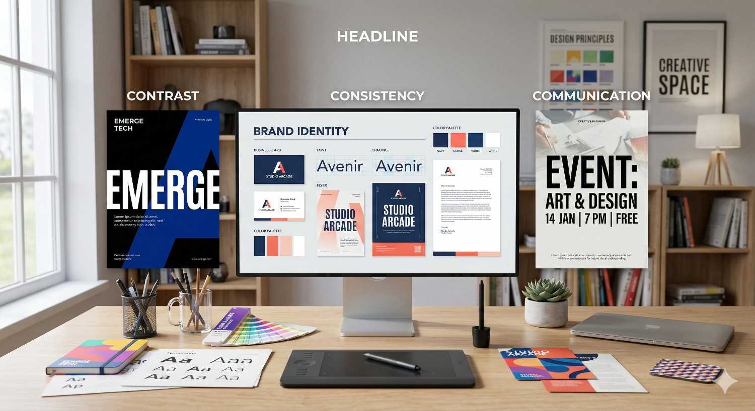
The three Cs provide a simple framework for evaluating any design before it goes to print. They are not abstract art theory. They are practical checkpoints that determine whether your poster, sign, or document will accomplish what you need it to do.
What Are the Three Cs?
The three Cs of graphic design are:
Contrast: The visual difference between elements that makes important information stand out.
Consistency: The uniform use of colors, fonts, spacing, and style across a design or set of materials.
Communication: The ability of a design to deliver a clear, specific message to its intended audience.
Every printed piece, from a single flyer to a full suite of business signage, depends on these three principles working in balance. Remove one, and the design breaks down. A sign with no contrast gets ignored. A brochure with inconsistent branding looks unprofessional. A poster that fails to communicate wastes paper and money.
Why the Three Cs Matter in Design and Print
Design principles matter more in print than on screen. Once ink hits paper or vinyl, there is no undo button. A digital ad can be revised in minutes. A batch of 500 printed brochures with poor contrast or unclear messaging represents a real cost.
For small businesses, event organizers, and individuals printing materials in Dallas, the three Cs serve as a pre-flight checklist. Before you submit files to a print shop, running your design through these three filters catches problems that would otherwise show up in the finished product.
Strong contrast ensures readability at the size and distance your piece will be viewed. Consistency builds recognition and trust with your audience. Clear communication means your reader knows exactly what to do next, whether that is visiting your store, calling a number, or attending an event.
How the Three Cs Work Together
The three Cs are not independent checkboxes. They interact. Contrast supports communication by directing the viewer's eye to the most important information first. Consistency reinforces communication by training your audience to recognize your brand across multiple touchpoints. And communication gives purpose to both contrast and consistency, ensuring that every design choice serves the message.
Consider a real example: a yard sign for a local Dallas business. Contrast between the background color and the text makes the phone number readable from the street. Consistency with the business's existing logo and color palette makes the sign instantly recognizable. Communication ensures the sign says exactly what it needs to say, nothing more, nothing less.
When one principle is weak, the others cannot compensate. A beautifully consistent design that fails to communicate is just decoration. A high-contrast layout with no consistency looks chaotic. The three Cs work as a system.
Contrast in Graphic Design
Contrast is the most immediately visible of the three Cs. It is the principle that determines whether someone can actually read and process your design, especially in print and signage where viewing conditions vary.
What Is Contrast?
Contrast is the degree of visual difference between two or more elements in a design. It is created through differences in color, size, weight, shape, or spacing. High contrast means elements are clearly distinct from each other. Low contrast means elements blend together.
In graphic design for print, contrast is not optional. It is the mechanism that creates visual hierarchy, the order in which a viewer processes information. Without sufficient contrast, every element on the page competes equally for attention, and the viewer processes none of it effectively.
Types of Contrast in Print and Signage
Several types of contrast apply directly to printed materials and signs:
Color contrast is the most common. Dark text on a light background, or light text on a dark background, creates the readability foundation for every printed piece. Color contrast also applies to images, borders, and graphic elements that need to separate visually from their surroundings.
Size contrast establishes hierarchy. A headline set at 48 points against body text at 12 points immediately tells the reader what to look at first. On signage, size contrast determines what is readable from 50 feet versus what requires close inspection.
Weight contrast uses bold, medium, and light font weights to differentiate headings, subheadings, and body copy. This is particularly effective on documents and brochures where multiple levels of information need clear separation.
Shape contrast places geometric elements against organic ones, or uses distinct shapes to draw attention to specific areas. A circular badge on a rectangular sign creates a natural focal point.
Spacing contrast uses tight and loose spacing strategically. Dense text blocks next to open white space create visual breathing room and guide the eye.
How to Use Contrast in Your Print Projects
When preparing files for professional printing, apply contrast with these specific actions:
Test readability at actual size. If you are designing a banner, zoom your file to the actual viewing distance. If the text does not pop against the background at that scale, increase contrast. This is the single most common issue with customer-submitted print files.
Use a contrast checker for color combinations. Tools like the WebAIM contrast checker work for print as well as digital. Aim for a contrast ratio of at least 4.5:1 for body text and 3:1 for large text and headlines.
Limit your color palette. More colors do not mean more contrast. Two or three well-chosen colors with strong contrast between them outperform a rainbow of similar tones. This also simplifies file preparation and reduces the risk of color-matching issues during printing.
Avoid placing text over busy images without a solid or semi-transparent background. This is one of the fastest ways to destroy readability on posters and signs. If your design includes a photo background, add a solid color block or overlay behind the text.
Consistency in Graphic Design
Consistency is the principle that builds trust, professionalism, and brand recognition across every piece of printed material your audience encounters.
What Is Consistency?
Consistency in graphic design means using the same visual elements, fonts, colors, spacing, and style rules throughout a single design and across a collection of related materials. It is the principle that makes a business card, a banner, and a storefront sign all look like they belong to the same organization.
Consistency does not mean every piece looks identical. It means every piece follows the same set of rules. The same two fonts. The same color palette. The same logo placement. The same margin structure. These shared rules create a visual language that your audience learns to recognize.
Why Consistency Matters for Business Materials
For businesses in Dallas printing multiple types of materials, consistency is directly tied to credibility. A customer who sees your yard sign, picks up your flyer, and then visits your storefront expects a unified visual experience. If each piece looks like it was designed by a different person, trust erodes.
Consistency also reduces design time and printing costs. When you establish a set of brand guidelines, even simple ones, every new piece starts from a proven template rather than a blank page. This means faster turnaround, fewer revisions, and less risk of errors.
For event organizers and individuals, consistency applies within a single project. A multi-page program, a set of directional signs, or a series of posters for the same event should all share a visual framework. This makes the materials easier to navigate and more professional in appearance.
How to Maintain Consistency Across Print Formats
Maintaining consistency across different print formats requires a few deliberate steps:
Create a simple style guide. Document your primary and secondary colors with exact values (CMYK for print, not just RGB or hex codes). List your fonts, including specific weights for headings and body text. Define your logo's minimum size and clear space requirements. This does not need to be a 50-page brand manual. A single page covers the essentials.
Use templates. If you print business cards, flyers, and banners regularly, create a template file for each format with your colors, fonts, and logo already in place. This prevents drift over time and ensures that anyone preparing files follows the same rules.
Convert colors to CMYK before submitting files. RGB colors on screen do not translate directly to print. A vibrant blue in RGB may print as a muted purple in CMYK. Converting your color mode before submission ensures your printed colors match your brand standards across every format.
Check alignment and spacing. Consistent margins, padding, and element spacing across materials create a subtle but powerful sense of professionalism. If your business card has a 0.25-inch margin, your flyer should use the same or a proportional margin.
Communication in Graphic Design
Communication is the purpose behind every design decision. Contrast and consistency serve communication. If a design does not communicate a clear message, it has failed regardless of how visually appealing it may be.
What Is Communication in Design?
Communication in graphic design is the successful transfer of a specific message from the design to the viewer. It encompasses the text content, the visual hierarchy, the imagery, and the overall layout working together to deliver one clear idea or call to action.
Effective communication in design means the viewer understands the message without effort. They do not need to search for the phone number. They do not need to guess what the business does. They do not need to read every word to understand the purpose of the piece.
Designing for Clear Messaging
Clear messaging in print design follows a simple hierarchy:
Lead with the most important information. On a sign, this is usually the business name or the primary offer. On a flyer, it is the headline. On a business card, it is the name and contact information. Whatever the viewer needs most should be the first thing they see.
Limit the number of messages per piece. A poster that tries to communicate five different things communicates none of them well. Each printed piece should have one primary message and, at most, one or two supporting details. A yard sign that says "Grand Opening, Saturday, 123 Main St" communicates effectively. A yard sign that adds hours, a menu, a website, a phone number, social media handles, and a tagline communicates nothing.
Use visual hierarchy to guide reading order. Size, contrast, and placement determine the sequence in which a viewer processes information. The largest, highest-contrast element gets read first. The smallest, lowest-contrast element gets read last, if at all. Design your hierarchy intentionally.
Choose imagery that supports the message. Every photo, icon, or graphic element should reinforce the primary message. Decorative elements that do not serve communication are visual noise. On printed materials where space is limited, every element must earn its place.
How Communication Affects Signage and Print Results
In signage, communication is tested under real-world conditions. A storefront sign is viewed from a moving car. A trade show banner competes with dozens of other banners. A directional sign must be understood in seconds by someone who has never been to your location.
These conditions demand ruthless clarity. The three-second rule applies: if a viewer cannot understand your sign's message within three seconds, the design has failed its communication objective.
For printed documents like brochures and programs, communication is tested by completion rate. Does the reader finish the piece? Do they take the intended action? Clear communication, supported by strong contrast and consistent design, dramatically increases the likelihood that your printed materials achieve their purpose.
Applying the Three Cs to Your Printing and Signage Projects
Understanding the three Cs is the first step. Applying them to actual print files is where the value is realized. This section bridges design theory and print production.
File Preparation Tips Using the Three Cs
Before submitting files to a professional print shop, run through this checklist:
Contrast check: View your design at the actual print size. Can you read all text clearly? Is there sufficient color difference between text and background? Are headlines visually distinct from body copy? If you are designing a large-format sign, step back from your screen to simulate viewing distance.
Consistency check: Are all fonts the same as your other materials? Are colors in CMYK mode and matching your brand palette? Is the logo the correct version (not stretched, not pixelated, not an outdated version)? Are margins and spacing consistent with your other printed pieces?
Communication check: Can someone unfamiliar with your business understand the message in under five seconds? Is there one clear call to action? Is the most important information the most visually prominent element?
Resolution check: Print requires a minimum of 300 DPI (dots per inch) for sharp output. Images pulled from websites are typically 72 DPI and will appear blurry or pixelated when printed. Verify that all images in your file meet the resolution requirement for your print size.
Bleed and trim: If your design extends to the edge of the paper or sign, include a bleed area (typically 0.125 inches on each side). This prevents white edges after trimming. Your print provider can specify exact bleed requirements for your project.
Choosing the Right Print Format for Your Design
Format Contrast Priority Consistency Priority Communication Priority
Business cards High (small size demands strong contrast) Critical (brand touchpoint) Contact info clarity
Posters High (viewed from distance) Moderate (event-specific) Single message focus
Banners Very high (outdoor/distance viewing) High (brand visibility) Three-second rule
Brochures Moderate (close reading) Critical (multi-page consistency Information hierarchy
Yard signs Very high (roadside viewing) High (brand recognition)Minimal text, maximum clarity
Document printing High (professional appearance) Readability and structure
Selecting the right format starts with your communication goal. A detailed message with multiple sections belongs in a brochure, not on a banner. A single bold statement belongs on a sign, not in a multi-page document. Match the format to the message, then apply contrast and consistency to optimize the result.
Common Design Mistakes That Hurt Print Quality
These mistakes violate one or more of the three Cs and are the most frequent issues seen in customer-submitted print files:
Too many fonts. Using more than two or three fonts in a single design breaks consistency and creates visual chaos. Choose one font for headings and one for body text. Add a third only if absolutely necessary.
Low-resolution images. A logo or photo that looks fine on screen at 72 DPI will print blurry at that resolution. Always use source files at 300 DPI or higher for print projects.
Text too close to the edge. Without proper margins and safe zones, text can be cut off during trimming. Keep critical content at least 0.25 inches from the trim edge.
Trying to say too much. Overloading a design with text, images, and competing messages is the most common communication failure. Edit ruthlessly. If a piece of information is not essential to the primary message, remove it.
Ignoring the viewing environment. A design that looks great on a computer monitor may fail completely on a 3-foot by 6-foot banner viewed from across a parking lot. Always design for the actual conditions where your piece will be seen.
Using RGB colors for print files. RGB is for screens. CMYK is for print. Submitting RGB files results in color shifts that can make your brand colors look wrong on the finished product.
How AlphaGraphics Dallas Helps You Get Print-Ready Designs
Not everyone has design software, experience, or time to prepare perfect print files. That is exactly why professional print providers exist. AlphaGraphics Dallas bridges the gap between your idea and a finished, professional printed piece.
Expert Design Guidance for Every Project
Whether you walk in with a finished file or a rough sketch on a napkin, the team at AlphaGraphics Dallas provides guidance at every stage. This includes reviewing your files for print readiness, advising on contrast and readability for your specific format, and helping you maintain brand consistency across multiple projects.
For customers without design experience, this guidance prevents the most common and costly mistakes before they reach the press. A quick file review catches low-resolution images, RGB color modes, missing bleeds, and communication issues that would otherwise result in a reprint.
Available Print Services and Formats
AlphaGraphics Dallas offers a full range of print and signage services for individuals and businesses:
Document printing: Black-and-white or color documents, reports, presentations, and manuals. Walk-in service available for customers without access to a printer.
Poster and large-format printing: Custom posters, banners, and oversized prints for events, promotions, and displays. Available in a range of materials including paper, vinyl, and fabric.
Custom signs and signage: Storefront signs, yard signs, directional signage, trade show displays, and vehicle graphics. Durable materials designed for indoor and outdoor use.
Business materials: Business cards, brochures, flyers, letterhead, envelopes, and presentation folders. Consistent branding across your entire suite of materials.
Specialty printing: Canvas prints, window graphics, wall murals, floor graphics, and custom packaging.
Fast Turnaround and Reliable Quality in Dallas
Located in Dallas, TX, AlphaGraphics provides fast turnaround times for both standard and rush orders. Walk-in customers can get documents printed on the spot. Larger projects like banners, signs, and custom materials follow a streamlined production process designed to meet tight deadlines without sacrificing quality.
Every project goes through quality checks that align with the three Cs: contrast is verified for readability, consistency is maintained with your brand standards, and communication is confirmed so your finished piece delivers the intended message.
Conclusion
The three Cs of graphic design, contrast, consistency, and communication, are the foundation of every effective printed piece. Applying these principles to your print and signage projects ensures your materials look professional, read clearly, and deliver results.
Whether you need a single document printed or a complete signage package for your business, understanding these principles helps you prepare better files and make smarter decisions about format, layout, and messaging.
We help Dallas customers turn designs into high-quality printed results every day. Contact AlphaGraphics Dallas to get expert guidance, fast turnaround, and reliable printing for your next project.
Frequently Asked Questions
What are the three Cs of graphic design?
The three Cs of graphic design are contrast, consistency, and communication. These principles guide designers in creating visuals that are readable, professional, and effective at delivering a clear message to the intended audience.
How does contrast affect print quality?
Contrast determines whether text and images are readable on a printed piece. Low contrast between text and background colors causes readability problems, especially on signs and posters viewed from a distance. High contrast ensures your most important information stands out.
Why is consistency important for business printing?
Consistency across printed materials builds brand recognition and trust. When your business cards, flyers, signs, and brochures all use the same fonts, colors, and logo placement, customers recognize your brand instantly and perceive it as more professional.
What file format should I use for professional printing?
PDF is the most widely accepted file format for professional printing. Save your files as high-resolution PDFs with fonts embedded, images at 300 DPI, and colors converted to CMYK. This ensures your design prints accurately and without unexpected changes.
How do I check if my design has enough contrast for a sign?
View your design file at the actual size and distance the sign will be read from. If you cannot read the text clearly within three seconds, increase the contrast by using darker text on a lighter background or vice versa. Online contrast checkers can also verify your color combinations meet readability standards.
Can I walk in to get something printed without a design file?
Yes. Many print shops, including AlphaGraphics Dallas, accept walk-in customers and can help you prepare files or work from basic materials you bring in. Staff can assist with formatting, layout adjustments, and file preparation to ensure your project is print-ready.
What is the difference between RGB and CMYK for printing?
RGB is a color mode used for screens and digital displays. CMYK is the color mode used for professional printing. Submitting files in RGB can cause colors to shift during printing, resulting in output that does not match what you see on your monitor. Always convert to CMYK before sending files to a print shop.
